Vue實現tab導航欄并支持左右滑動功能
本文主要介紹:利用Vue實現tab導航欄,并且通過flex布局實現左右滑動,計算按鈕的位置,當點擊第一屏展示的最后一個且還有元素未展示時,自動滑動顯示出未顯示的元素。
tab導航欄布局:
<section class='theme-list'> <div ref='fixednav'> <div class='fixed-nav-content'> <pv-for='(item, index) in theme':key='index': @click='changeTab(index, $event)' >{{ item }} </p> </div> </div></section>
theme: [’CSDN博客’, ’博客園’, ’高考加油’, ’中考加油’, ’小歡喜’, ’七十周年’],activeId: 0
導航欄樣式代碼:
.theme-list { margin-top: 12px;}.fixed-nav { overflow-x: scroll; -webkit-overflow-scrolling: touch;}.fixed-nav-content { display: flex;}.tab-title { padding: 0 13px; margin-right: 12px; color: #141414; border-radius: 13px; font-size: 12px; flex-shrink: 0; height: 0.52rem; line-height: 0.52rem;}
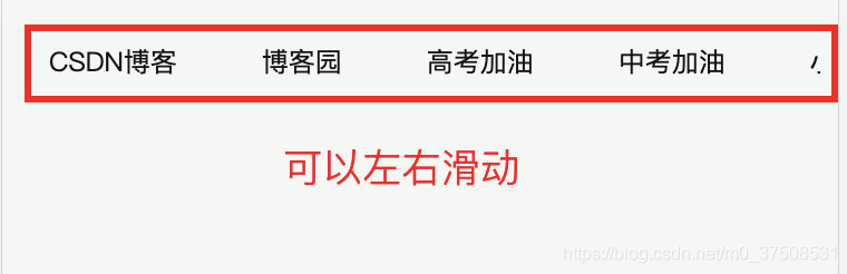
此時我們可以實現下面的樣式,并且可以左右滑動tab:
需要注意的是,在樣式代碼中需要添加flex-shrink : 0,這樣才會當tab寬度大于外部容器寬度時不會收縮。
這樣,我們基本的tab導航欄已經實現了,現在我們來實現:點擊“中考加油”時,整個tab向左滑動,顯示出剩下的tab元素。
changeTab(id, event) { // 如果選擇的和當前激活的不同 if (id !== this.activeId) { this.activeId = id; // 計算當前按鈕的位置,看是否需要移動 const spanLeft = event.clientX; // 當前點擊的元素左邊距離 const divBox = document.querySelector('.select-tab').clientWidth / 2; // 點擊的元素一半寬度 const totalWidths = document.body.clientWidth; // 屏幕總寬度 const widths = totalWidths / 2; // 一半的屏幕寬度 const spanRight = totalWidths - spanLeft; // 元素的右邊距離 const scrollBox = document.querySelector('.fixed-nav'); // 獲取最外層的元素 const scrollL = scrollBox.scrollLeft; // 滾動條滾動的距離 // 當元素左邊距離 或者 右邊距離小于100時進行滑動 if (spanRight < 100 || spanLeft < 100) { scrollBox.scrollLeft = scrollL + (spanLeft - widths) + divBox; } }}
通過這個方法可以實現tab的自動滾動了,但是此時還有一個問題是:在滑動的時候會顯示出滾動條,顯然是不太美觀的。
/*定義滾動條高寬及背景 高寬分別對應橫豎滾動條的尺寸*/::-webkit-scrollbar { width: 0.01rem; opacity: 0; display: none;}/*定義滾動條軌道 內陰影+圓角*/::-webkit-scrollbar-track { background-color: #fff; opacity: 0;}/*定義滑塊 內陰影+圓角*/::-webkit-scrollbar-thumb { width: 0.01rem; border-radius: 0.01rem; opacity: 0;}
這樣,一個導航條就實現了,可以在結合公司的業務修改一下導航條的樣式就可以啦!
到此這篇關于Vue實現tab導航欄,支持左右滑動的文章就介紹到這了,更多相關Vue左右滑動導航欄內容請搜索好吧啦網以前的文章或繼續瀏覽下面的相關文章希望大家以后多多支持好吧啦網!
相關文章:

 網公網安備
網公網安備