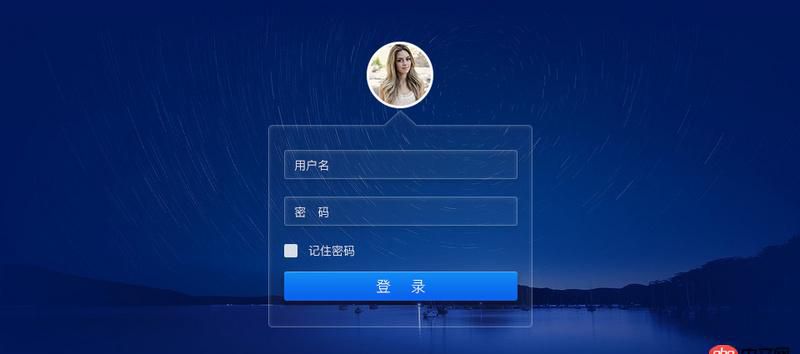
html - 請教,下圖登錄頁如何用css實現?半透明的邊框怎么做?
問題描述
問題解答
回答1:試了一把demo回答2:謝謝各位答主的答案,參考了下,然后去學習了下css3屬性box-shadow和border-image,自己寫的一個demo登錄頁demo
1. 背景p鋪滿整個屏幕,再給p添加背景圖片以達到效果
.bg-p{ background: url(’/img/bg2.jpg’) center;} 2. 頭像
<img src='http://www.aoyou183.cn/img/user-4.png'/>
添加css樣式,border-radius: 50%;
3. 邊框3.1 半三角:偽元素::after一個p,順時針旋轉45度,三角的兩邊是p的上、左邊框,after偽元素特性置于p的下方,不會遮擋住主體的p
.box::after { content: ’’; display: block; width: 40px; height: 40px; position: absolute; top: -20px; left: 50%; margin-left: -21px; border-top-left-radius: 4px; border-left: 2px solid rgba(255,255,255, 0.3); border-top: 2px solid rgba(255,255,255, 0.3); transform: rotate(45deg); /*旋轉45度*/* box-shadow: inset 1px 0 0 rgba(255,255,255,0.2), inset 0 1px 0 rgba(255,255,255,0.2);}3.2 上邊框:偽元素::before
偽元素before是一個400px*2px容器,分開的兩邊邊框通過設置容器的box-shadow,左右內陰影
.box::before { content: ’’; display: block; width: 400px; height: 2px; position: absolute; border-top-left-radius: 4px; box-shadow: inset 171px 0 0 0 rgba(255,255,255, 0.2), inset -171px 0 0 0 rgba(255,255,255, 0.2); /*通過內陰影實現邊框效果*/}3.3 其余邊框:border
.box{ border: 2px solid rgba(255,255,255, 0.2); /*增加半透明邊框*/ border-top: 0; /*去掉上邊框*/}4. 透明輸入框
背景透明,邊框半透明,添加內外漸變陰影
.form-input{ background: transparent; /*背景透明*/ border: 2px solid rgba(255,255,255,0.3); /*邊框半透明*/ box-shadow: inset 0 0 4px rgba(255,255,255,0.2),0 0 4px rgba(255,255,255,0.2); /*內外漸變陰影*/}回答3:
這個如果只兼容現代瀏覽器用css3中border-image或者漸變差不多可以做出來的,如果兼容ie8直接切圖就好
回答4:ie8以下建議用背景圖片,9以上box-shadow用rgba設置邊框顏色及透明度 input框背景rgba設置背景顏色及透明度 ie-css3.htc 也可以讓ie低版本支持box-shadow、radius等屬性 ps 整個登錄框其實都有背景色的 只是很淺 但是有
相關文章:

 網公網安備
網公網安備